FabriqFabriq
Website: Fabriq
Case study: Designing for failure states in Fabriq
is a personal relationship management tool that enables users to be intentional about how they prioritize, track, and invest in the people close to users. You can add contacts to your inner, middle, or outer circle, set connection frequencies, and note down important details. While working with them, our focus was on increasing retention. In order for users to gain value out of Fabriq, they must use the app as a means of personally scheduling who to talk to. In my behavioral audit, I therefore included a section about how to Intentionally design for failure statesIntentionally design for failure states
A failure state is when users fail to reach their goal in some way. In goal striving, it is inevitable that the user will experience failure states, because a goal is by definition a discrepancy between your desired state of reality and your present state. If we didn't have failure states, the Intention-Behavior Gap There tends to be a gap between what people intend to do and what they actually do, Sheeran & Webb 2016::rmn would be a non-issue (rather than one of the hardest problems in t....
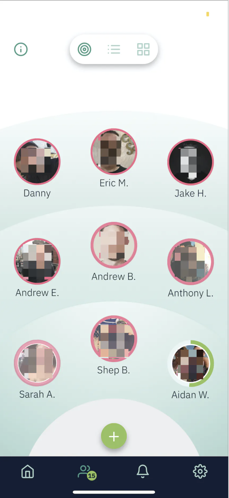
When you should connect with a person next is communicated through their touch-base timer, a circle around the contact's picture that is green when it's full, yellow when it's half-full, and red when it's close to empty. People in your inner circle have shorter loops, whereas people in your outer circle might take a month or more to go through a full cycle.
Users generally like this and find it to be helpful. If the circle around a contact's profile is yellow or red, that means that reaching out can be treated like a todo list item to check off. However, each time the touch-base timer goes into the red, the user experiences a small feeling of failure. If the user lets too many connections slip, then their screen will start to look like this.

Just imagine the emotional experience of the user at this point. They have a dozen or more connections– real people in their lives that matter to them– that they have ignored. It probably feels like a daunting and anxiety-inducing task to recover. From a Difficulty MatchingDifficulty Matching
The emotional experience of Flow
A flow state is often characterized as optimal human experience. It’s an experience where you are fully focused and energized in what you’re doing, often experiencing a high level of creativity and losing track of time.
The general emotional experience that is being described here is that when a task is too challenging for a user’s current level of ability, they’ll get frustrated and give up. Alternatively, when the task is far too easy, they are likely t... perspective, we're essentially watching the user fail to meet the challenge of maintaining their intended connection frequency and then giving them the more challenging task of recovering their red contacts while simultaneously maintaining their yellow and green contacts. After seeing a few contacts go into the red, the user starts to feel they have passed the point of no return and give up on Fabriq.
Our first solution is to give the user a fresh start if it reaches the point where most of the user's contacts are in the red. Fabriq will refresh all of the user's timers, removing the failure state, and take the user through a series of prompts to reduce the amount of social connections they need to make per week. This is to unburden the user from past mistakes, prompt the user to reduce their challenge, and prompt the user to make their next attempt with a different approach.
The fresh start effect is well-supported in the behavioral science literature as a method to recover from failure by making the user, unburdened by past imperfections, feel more capable and willing to take on aspirational goals.
What if we want to reduce the likelihood that a user gets to the point where most of their contacts are in the red in the first place? Before, when it was time for a user to reach out to one of their contacts, they had two choices: they could reach out or they could ignore the touch-base timer. Reaching out requires significant effort and ignoring the timer means the user has experienced a small failure.
Here we decided to give users the option to "snooze" a connection. If Fabriq sends the user a push notification telling them it's time to reach out to a contact and the user doesn't feel like it, they can snooze that contact and partially refill their timer. Giving the user an option to push back a connection without ignoring their contact reduces the likelihood that any individual contact will go into the red. This in turn reduces the likelihood that any user will experience the total failure of seeing most of their contacts in the red.