The emotional experience of Flow
A flow state is often characterized as optimal human experience. It’s an experience where you are fully focused and energized in what you’re doing, often experiencing a high level of creativity and losing track of time.
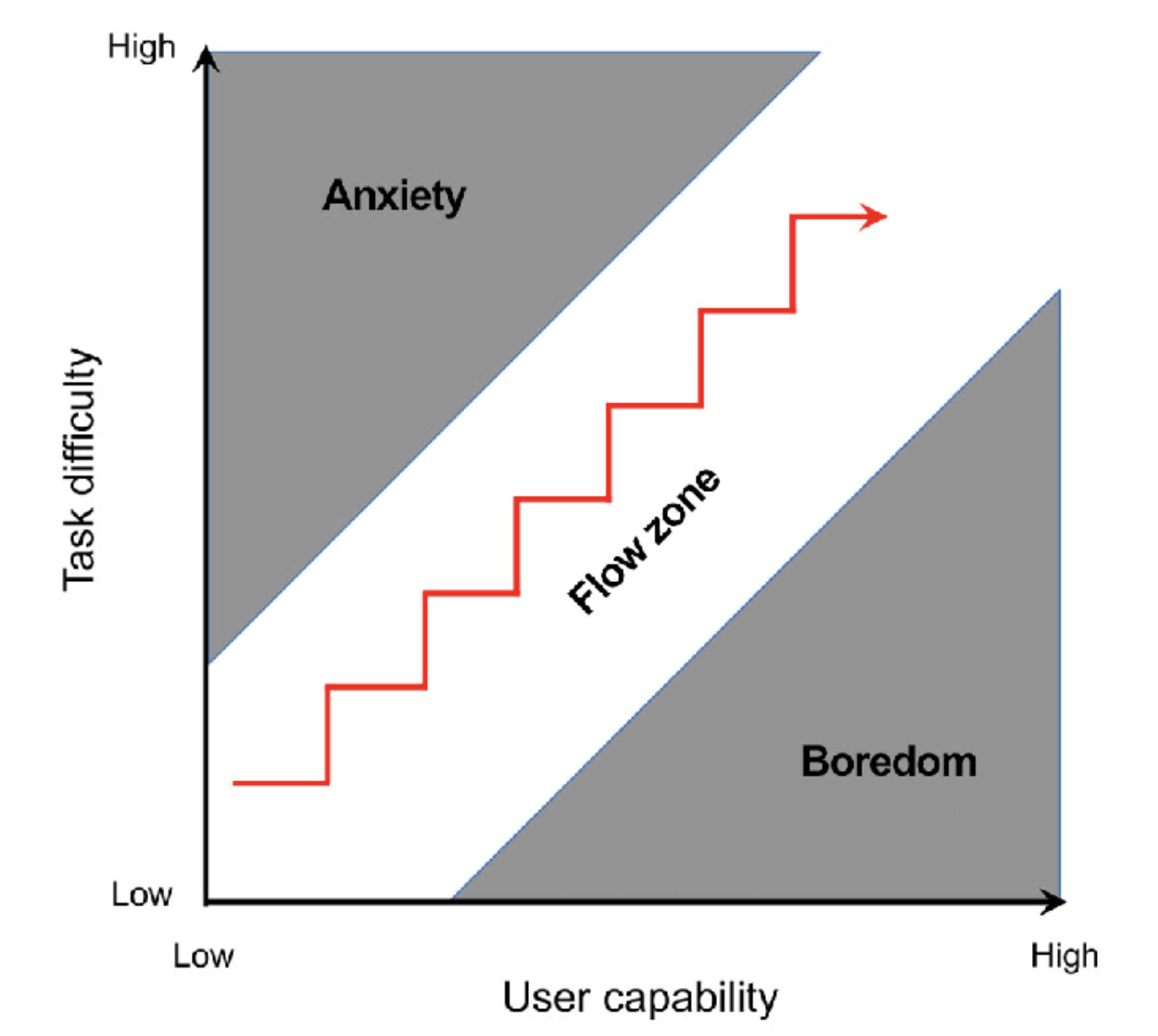
The general emotional experience that is being described here is that when a task is too challenging for a user’s current level of ability, they’ll get frustrated and give up. Alternatively, when the task is far too easy, they are likely to experience boredom. Both of these are potential Failure stateFailure state
Index
Intentionally design for failure states
Difficulty Matching
s where the user may lose interest in the app.
As a rule of thumb, I find it best to match the difficulty of the task with the skill level of the user.
The model feels, in a sense, incomplete. I argue that difficulty matching in conjunction with Goal ResonanceGoal Resonance
When an app is goal resonant, it takes the users actions (the inputs) and amplifies/transforms them into goal achievement (the outputs). Apps that are goal resonant enable the user to bridge the Intention-Behavior Gap. It is important to Speak to the user with a shared vocabulary so they know that the app is goal resonant.
Persuading people to do behaviors that are out of alignment with their goals and values is an uphill battle. Since Products are fundamentally voluntary, the only way you'r... that produces positive emotions in users.
Difficulty matching in AdoptionAdoption
This page is simply to collect pages that link to it. Use this to jump to other locations.
People start using an app with different prior skill levelsPeople start using an app with different prior skill levels
One of the companies I work with, GuidedTrack, is a simplified programming language that allows subject matter experts to create web applications, interactive slideshows, and experiments with no prior coding skill. Since it's all done through text rather than a GUI like Qualtrics or Google Forms, it speeds up program construction and gives it some extra power.
If someone starts using it with prior coding experience in any language, they probably already understand core concepts like "use ind.... Somebody might start to learn how to use an app and they pick up on it quickly because they have a high prior skill. On the flip side, other users might not get it immediately.
If I can only provide value at one skill level, then users at that skill level are the only ones I can count on sticking around.
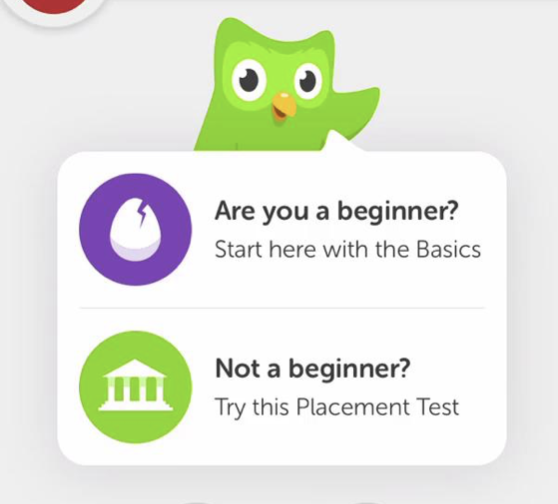
Duolingo gives you a placement test at the beginning of your experience that allows you to skip a good amount of content. This is useful so that people like me who come in already knowing a good amount of Spanish don't get bored being forced to review how to say "boy" or "girl" before we get to the content that's actually interesting to us.
An alternative approach might be starting the user off with simple tasks and, based on their performance, you can escalate, de-escalate, or maintain difficulty level for the next task. In game design, this is referred to as Dynamic difficulty. Resident Evil 4 does this, where if you are fighting zombies and dying frequently, they'll give you less zombies with less strength. Alternatively, if you're constantly successful, they'll present you with a greater challenge.
Difficulty matching in continued user involvement (retention)
Apps with continued user involvement are responsive to increasing skill levels over timeApps with continued user involvement are responsive to increasing skill levels over time
Near the beginning of a person's personal productivity journey, they may be fine with using Apple Reminders as their form of task manager. Eventually, User skill level increases over time, so they may want to sort tasks into projects. Apple Reminders can handle that, so the user remains satisfied.
Eventually, they read Getting Things Done and realize that the Lists within Apple Reminders just won't do the trick. According to the principles of Difficulty Matching, this is the point where they... because User skill level increases over timeUser skill level increases over time
Imagine that you have just started to use Excel or Photoshop. Both of those apps have an insane amount of functionality, and it would be unreasonable to expect the user to understand what is possible and how to do it immediately. Over time, with continued User Involvement, they will simply grow more comfortable with the app.
The most successful app adoptions come from a project, because they give the user a reason to increase their skills. As they work on their projects, they'll bump up agai....
Difficulty matching in push notifications
My thoughts on this sort of mesh difficulty matching with the Fogg Behavior ModelFogg Behavior Model
author:: BJ Fogg
This model isn't based on experimental evidence, but is rather a bunch of formalized common-sense assumptions. Use it as a set of rules of thumb that are generally good to follow and don't pretend like it's all the psych you need to make a good product and you'll be fine.
Not much scientific evidence behind this model specifically, but seems like it’s essentially a formalization of Friction and Fuel/3Bs, positive pressures/negative pressures, etc. with some common sen....
A push notification is essentially an ask. Whenever a user receives a push notification, they are being asked to do something. Additionally, push notifications are ephemeral. If users receive a push notification and they don't respond to it immediately, then it will generally fade into the background and be forgotten.
If what users are being asked to do is too challenging to do in the present moment or they simply don't care enough, then they won't do it and it will be forgotten. If this happens too often, then the user may fall into the habit of ignoring push notification.
The app doesn't know what is going on in the lives of the user in the moments when they send a notification, so if there is only one behavioral response to that notification, then the app is betting on serendipity.
One possible solution is to simply do low-effort asks, but this may lead to the user getting bored. Another possible solution is to give the user multiple possible responses to a notification that account for varying levels of motivation, skill, and ability
An example of this is how some email apps allow you to snooze an email to return to your inbox later as a possible response to seeing the email. This is to account for the difficulty of the ask (respond to an email) being too high for your current level of motivation and ability.
Games offer many approaches to difficulty matching
Dynamic Difficulty
Dynamic difficulty is when the difficulty level dynamically adjusts in response to the user's demonstrated skill. Highly skilled behavior leads to higher difficulty, low skilled behavior leads to lower difficulty. This creates a negative feedback loop, allowing the developer to Intentionally design for failure statesIntentionally design for failure states
A failure state is when users fail to reach their goal in some way. In goal striving, it is inevitable that the user will experience failure states, because a goal is by definition a discrepancy between your desired state of reality and your present state. If we didn't have failure states, the Intention-Behavior Gap There tends to be a gap between what people intend to do and what they actually do, Sheeran & Webb 2016::rmn would be a non-issue (rather than one of the hardest problems in t... by giving a struggling player an new advantage.
Resident Evil 4
Resident Evil 4 is a zombie survival game where if you are playing well, then they'll send more zombies your way and the zombies do more damage. If you have died multiple times in an area, then the opposite occurs. The developers never explicitly discussed this, because it could be seen as punishing success, even though this generally functions to keep the player within the range of optimal difficulty described in the flow model.

Duolingo
Duolingo is a language-learning app where they give you a placement test upfront. If you perform well then you'll skip to a later point in the user journey so more skilled language speakers don't get bored. This isn't exactly dynamic difficulty since it comes upfront rather than adjusting based on revealed skill, but I'll include it anyway.
Linear Difficulty Curve
In games with a linear difficulty curve, every player experiences the same progression in difficulty from beginning to end, allowing for an authored user experience.
Fabulous
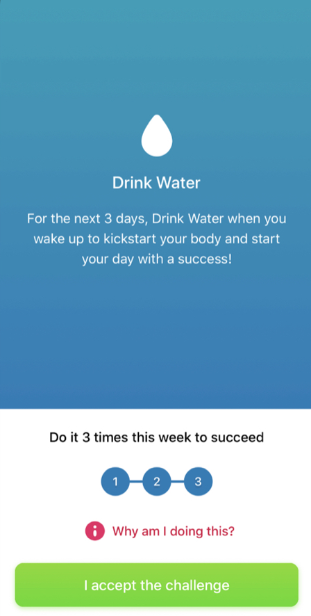
Fabulous is a habit/routine tracking app built in collaboration with the Center for Advanced Hindsight in order to help people form healthy habits. Every user is started off with the goal of drinking a cup of water first thing in the morning for three days in a row. Once the user has shown themselves to be capable of this morning routine, other activities are added to their routine, one by one, in a slowly escalating difficulty curve.
Many users who have worked with other habit trackers before may get bored from the slow and easy start. However, if users had the agency to give themselves more challenging morning routines, then they may be too ambitious and give themselves harder goals than they can handle. Fabulous is targeting people who are struggling to form healthy habits so they are okay with restricting the user's agency to adjust their own challenge.
If People start using an app with different prior skill levelsPeople start using an app with different prior skill levels
One of the companies I work with, GuidedTrack, is a simplified programming language that allows subject matter experts to create web applications, interactive slideshows, and experiments with no prior coding skill. Since it's all done through text rather than a GUI like Qualtrics or Google Forms, it speeds up program construction and gives it some extra power.
If someone starts using it with prior coding experience in any language, they probably already understand core concepts like "use ind..., then a linear difficulty curve can fall apart quickly without the fail-safe of user agency. This is why a linear difficulty curve should be well-tested to be suitable for the app's target users. It's essentially a bet that the designer's idea of the right difficulty progression is right for all or most of your users!
Scoring based difficulty
Scoring based difficulty allows the user to play at any level of difficulty that they choose and increase the challenge by aiming for a higher score. Imagine grades in school - you can make your homework easier by aiming for Cs instead of As. User goals determine the challenge.
When well executed, it makes clear to the user exactly how they can achieve a higher score. More challenging playstyles are more rewarding, often because the incentivized playstyles are simply the most fun. As far as I can tell, scoring based difficulty is under-explored in apps.
Sonic the Hedgehog
In Sonic the Hedgehog, at the end of a level, you receive a score that is broken up into categories. A high score means you moved through the level fast, you did tricks, and you collected rings. In other words, a high score means you played through the level in a challenging way that is possibly the most fun way to play. It signals mastery, which many players desire.

Opus Magnum
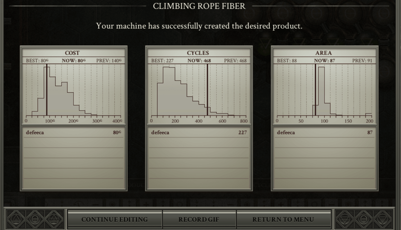
Opus Magnum is a problem solving game where each problem you're given has a million different solutions. After completing a problem, your solutions are compared to the rest of the world based on three histograms, which represent three different scores placed into the context of social comparison. The line in the histogram being further left means you're doing better than more people. You have the opportunity to redo the problem and attempt to find a new solution if they are dissatisfied with any of their scores.
I love this implementation of scoring based difficulty because it uses social comparison to help the user to judge what's good and bad. I distinctly remember solving one of the early puzzles only to realize I performed worse than average on cycles (the efficiency of the machine I built). I thought to myself, "I'm better than that," and proceeded to spend another hour or so coming up with different solutions to a problem that I already solved.
Grammarly
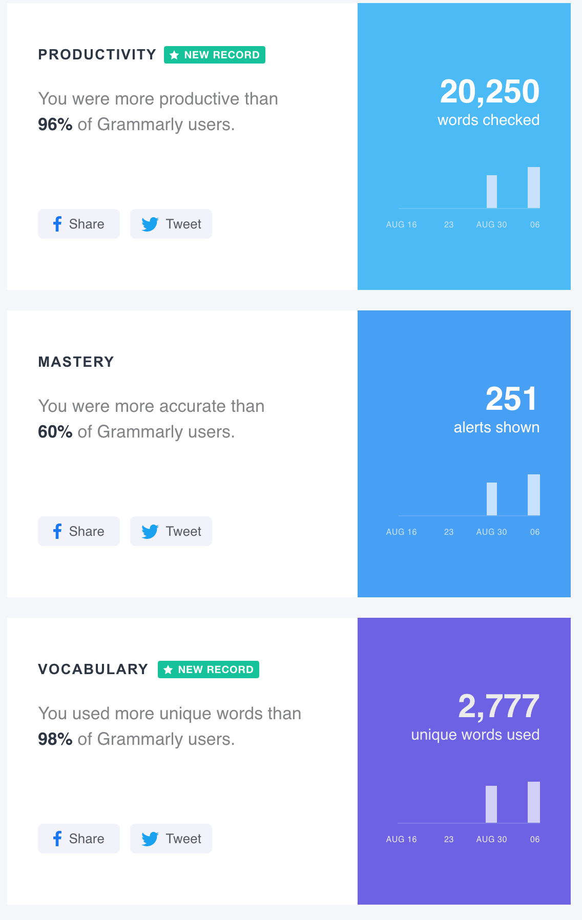
Grammarly takes a similar approach to Opus Magnum, using social comparison to help the user determine what scores they care about achieving. Additionally, they compare your performance to your past performance, reinforcing a goal around improvement. This is effective because productivity, grammar mastery, and vocabulary are all meaningfully related to writer goals.
 Oops, looks like I could improve my grammar.
Difficulty Level Selection
With difficulty level selection, the user makes a choice about how much effort they want to commit to the game.
Steamworld Heist
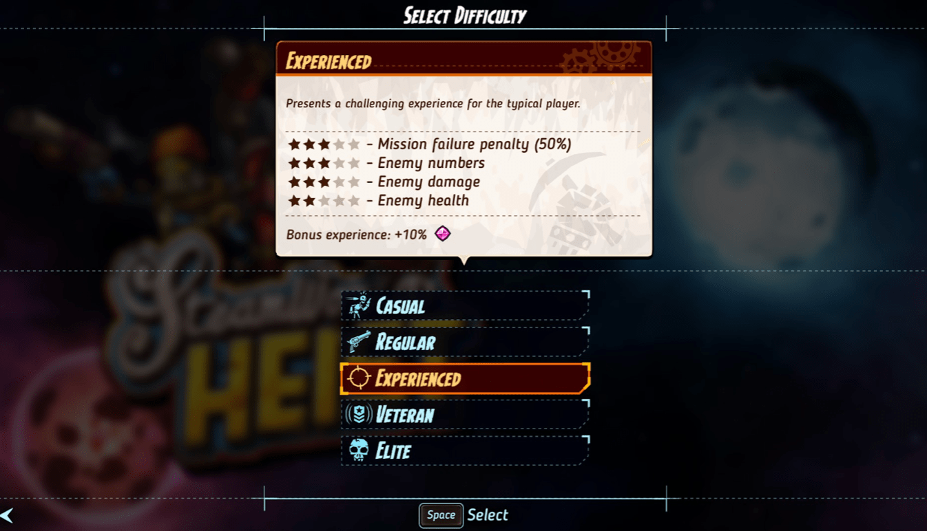
Steamworld Heist lets you select your level of difficulty before you start playing. Harder difficulties reap greater rewards. People in general like to see greater effort lead to greater reward, regardless of what app they are using.
The problem is of course that people don't have a mental modelmental model
for what each difficulty level means before they start playing the game. Steamworld Heist addresses this problem by making the parameters of each difficulty level explicit for comparison. This doesn't remove the problem though, so difficulty isn't just a choice you make upfront - you can change it at any point!
Duolingo
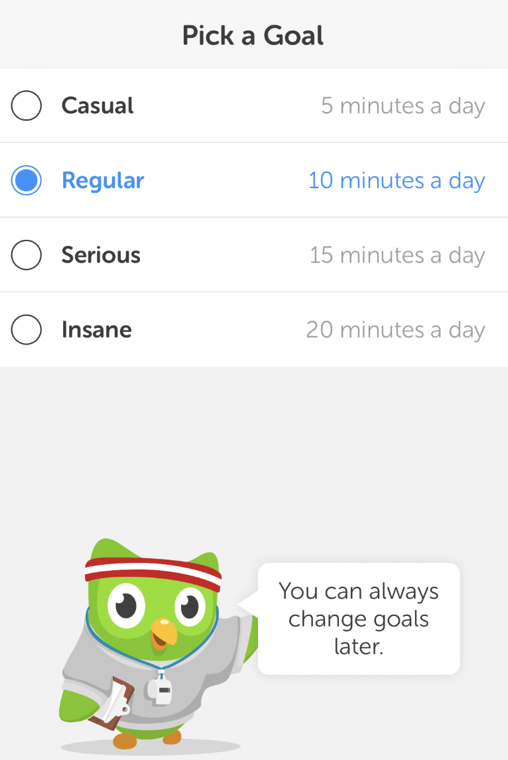
During the onboarding, Duolingo asks you to select how much you would like to practice per day. Notice how it lets users change their goals later? This is because they want the user to continue their success even if User goals change over timeUser goals change over time
A user’s goals 1 week into using your app and 6 months are rarely the same. “Elder users” often won’t even retain the goals that they had at the start of their experience. Apps with continued user involvement enable the user to accomplish multiple goals to maintain users through full goal transitions.
New users do not yet have the vocabulary to understand the app. User skill level increases over time, giving the user new vocabulary to conceptualization and express desires that they didn’t ha.... Additionally, it reduces the pressure to make the "right" decision during the onboarding.
One difference that you may notice between this and the Steamworld Heist implementation is that even though you do reap greater rewards with greater effort in both systems, Duolingo doesn't point that out. I wonder why?
