We live in a world of light pens
I keep coming back to this video from Mike Caulfield, where he describes the concept of “hard to learn, easy to use” in a way that feels relevant to Continuous Onboarding, so I thought I’d share my thoughts.
Before Douglas Englebart invented the computer mouse, we had the light pen. You can think of it sort of like a stylus people would use on their computer screens. People were already familiar with how to use pens on paper, so within 5-10 seconds, people could figure out how to use it. The mouse was trickier. It had multiple buttons, and moving a cursor around on the screen by moving your hands on a table was a weird notion for the time. A mouse afforded more possibility and comfort, but it had a learning curve.
When Doug would put two people against each other on the same task, mouse users were initially slower, but "very quickly they start[ed] to outpace the person with the light pen, and they start[ed] to achieve a fluidity of speed and expertise that the person with the light pen never achieves."

Photo of the Hypertext Editing System (HES) console in use at Brown University, circa October 1969. The photo shows HES on an IBM 2250 Mod 4 display station, including lightpen and programmed function keyboard, channel coupled to Brown's IBM 360 mainframe. Original photo by Greg Lloyd 1969. - Wikipedia
We live in a world of light pens. We infantilize people with software that is built to be intuitive from the start but can't do anything serious because the developers were scared of requiring the user to learn anything new.
From the video:
"People are bragging that infants can use iPads as if this was a point of pride rather than something horrifying… This is why we live in a world where most things are easy to learn, but hard to use. By hard to use, I don't mean that we feel they are difficult, but that we never reach our capacity to meld with these systems because we've chosen this path."
The user’s journey to expertise
Don't get me wrong, upfront onboarding can be a perilous time. Without the right kind of supportive design, you lose users. Many apps are both hard to learn and use, and I would bet they have high churn. But we don't need to be afraid - we just need a better framework for understanding the user's overall learning journey. This is what I'm trying to communicate through Continuous onboardingContinuous onboarding
Horizontal products like Notion, Airtable, Excel, and Obsidian are all powerful/flexible and require learning and expansion of use cases over time to wrap your head around them. Given that, why do they only teach people how to use the app for the first few minutes?
It's not just horizontal products though. Continuous Onboarding applies to most apps that aren't just "open, press a button, and close." Are you continuing to add features over time that would benefit users that are more than a mo....

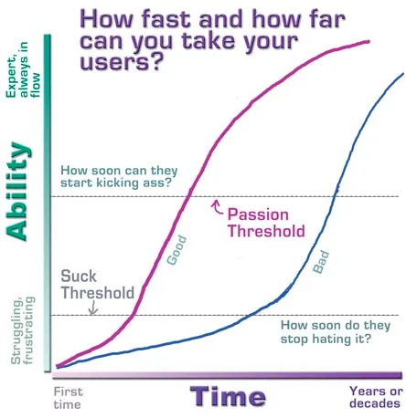
In this graph from Kathy Sierra’s “Badass: Making Users Awesome,” she describes a “Suck Threshold.” Below this point, the user has not yet figured out how to gain value. This is where an upfront onboarding is important.
We don't need to teach the user everything at the beginning. We can spread learning out as long as users recognize that their own involvement is bringing them closer to goal accomplishment. That is what motivates them to keep at it. As designers, we need to think of User InvolvementUser Involvement
Imagine purchasing a gym membership in order to lose weight or grow more muscular. Having a gym membership is not enough on its own! In order to successfully accomplish that goal, you would need to work out regularly on the right muscle groups. You might have a higher likelihood of success if you participate in exercise classes or hire a personal trainer. Your outcomes are shaped by your own behavior in the gym.
User involvement is defined by the set of user behaviors that lead to experienci... as a resource we get to tactically spend, while recognizing our tools to increase user involvement through motivational techniques.
I'm a big believer in "low floor, high ceiling." It shouldn't take much effort or time to gain value out of the system. As the user's skill grows, user goals will get more sophisticated and variedThe hard problem of onboarding horizontal products
In order to successfully onboard a Horizontal product, we need to deliver an experience that is initially meaningful to groups of people who understand and care about different things.
There are individual differences between new users in their initial user goals and People start using an app with different prior skill levels. This makes it difficult to Speak to the user with a shared vocabulary because there is no single user group to speak to. The Upfront onboarding needs to teach the user.... If we want to retain users, we need to cater to their six month goals just as well as their first week goalsApps with continued user involvement respond to changing user goals over time
New users do not yet have the vocabulary to understand the app, but as User skill level increases over time, so does their vocabulary. They are able to conceptualize and express desires that they couldn’t express before, so User goals change over time. If the app can only handle the user's goals 2 weeks in but not 2 months in, then it can't expect the user's continued involvement.
This points to the importance of Continuous onboarding for Difficulty Matching. If the user's skill level doesn'....
“North star for Roam Research is Excel. Easy enough for 750M people to use, powerful enough that you can spend your whole career working 40+hr a week in it and still find new ways to use it. Low floor, High Ceiling - to quote Gordon Brander”
“Intuitive design" should be less about designing an app with immediately obvious interactions and more about design that builds intuition through feedback loops. This distinction is especially important if you're building an innovative product, where users lack prior intuition.
I wish app developers and designers would think seriously about creating a smooth learning curve from novice to expertProvide a smooth learning curve from new user to power user
Apps built for power usage are capable of so many things that they can't be learned in a day. This points towards the necessity of Continuous onboarding - if we tried to shove all of that information down the user's throat too early, they would just get intimidated and quit.
Given that I'm working on the onboarding for GuidedTrack, I'll talk about how we're creating a smooth learning curve. If a goal is Removing GUI elements as the user's skill level increases to allow the user to interact m.... What are the stages of development, and how do we facilitate the ramp up? How are users likely to fail along the way, and how might we help them recover?Intentionally design for failure states
A failure state is when users fail to reach their goal in some way. In goal striving, it is inevitable that the user will experience failure states, because a goal is by definition a discrepancy between your desired state of reality and your present state. If we didn't have failure states, the Intention-Behavior Gap There tends to be a gap between what people intend to do and what they actually do, Sheeran & Webb 2016::rmn would be a non-issue (rather than one of the hardest problems in t... Continuous onboarding! I don't get why everyone expects all onboarding to be upfront. We should instead focus on the behavioral science of building expert intuition and facilitating goal accomplishmentProducts are fundamentally voluntary
People can always choose to use the product, use an alternative, or use nothing at all. In fact, not using your product is their default state of being, and you’re trying to get them to do something different and effortful in using your product. Adoption requires a baseline of user involvement in order to overcome inertia.
It’s easier to facilitate people doing something that they want to do than it is to convince them to do something they don’t want to do. It’s easier to enhance their desir... for inspiration.
The question we need to ask is: how might we make it rewarding to progress along the path to power user?