Apps built for power usage are capable of so many things that they can't be learned in a day. This points towards the necessity of Continuous onboardingContinuous onboarding
Horizontal products like Notion, Airtable, Excel, and Obsidian are all powerful/flexible and require learning and expansion of use cases over time to wrap your head around them. Given that, why do they only teach people how to use the app for the first few minutes?
It's not just horizontal products though. Continuous Onboarding applies to most apps that aren't just "open, press a button, and close." Are you continuing to add features over time that would benefit users that are more than a mo... - if we tried to shove all of that information down the user's throat too early, they would just get intimidated and quit.
Given that I'm working on the onboarding for GuidedTrackGuidedTrack
GuidedTrack is a simple low-code application that allows you to make surveys, experiments, web applications, online courses, signup forms, and more. Spark Wave built GuidedTrack so that it could build advanced studies and rapidly prototype, and is making the software available more broadly.
Alternative study platforms like Qualtrics and Typeform required so much clicking and dragging that they were tedious and took forever to build. Additionally, it was difficult to package the study itself ..., I'll talk about how we're creating a smooth learning curve. If a goal is Removing GUI elements as the user's skill level increasesRemoving GUI elements as the user's skill level increases
I've noticed a really interesting trend lately in apps built for power usage… When the user starts out, they have a GUI (Graphical User Interface) that helps them learn how to do things. As User skill level increases over time, they can actually disable elements of the GUI, decreasing the clutter on the screen that they no longer need as a memory aid for how to do X or Y.
Take a look at how Figma shows you all of these buttons you can click that would modify your selection. This helps the ne... to allow the user to interact more directly with our data structure by just typing what they want to happen, then we need to give them training wheels to go from stage to stage.
Below are just a few examples of us thinking about the stages of a user's progression and how we might provide an on ramp to the next stage.
Side-by-side preview
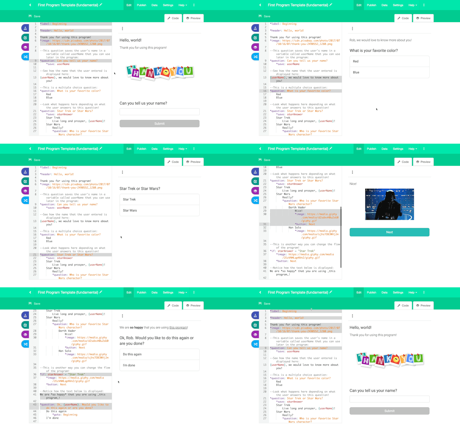
When new users are learning how to read the code, we want them to use the GuidedTrack Live PreviewGuidedTrack Live Preview
Originally, GuidedTrack had two separate views for working with your program. You could either be in the code view, where you were editing code, or in the preview, where you saw the output of your code.
There were a few problems with that. One was that people would need to read and write code while picturing in their head what the output would be. Then when they were looking at the preview, they needed to remember the code that would produce what they were seeing. This meant that it was chal.... This will help them understand exactly what code produces the output that they see in the preview, helping them gain an early mental modelmental model
of how GuidedTrack works before they even create anything.

Toolbar
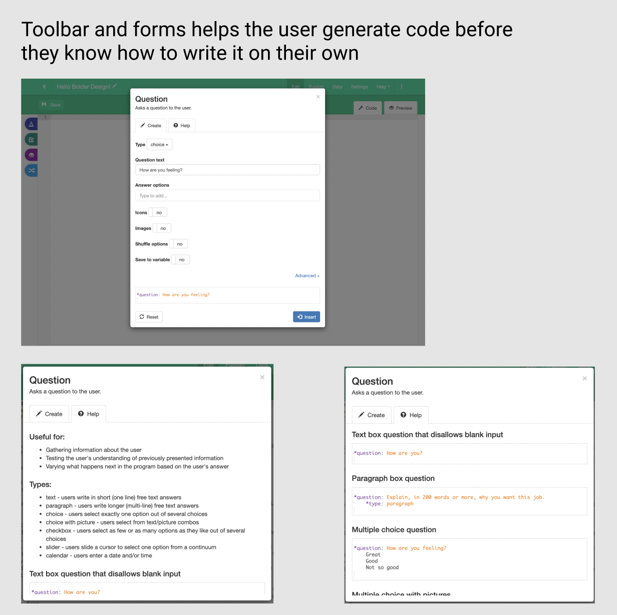
We expect brand new users to use the toolbar. They can find whatever command they are trying to execute and just fill out a form that generates code for them. This allows them to write code before they know how to write code!

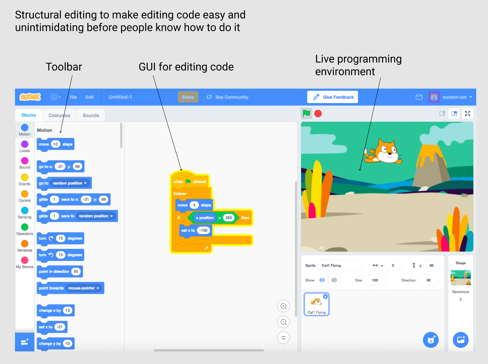
Another way to do this would be something like the Scratch visual editor.

Contextually aware autocomplete
The fastest way possible to create programs in GuidedTrack is to type code without looking at references. As they start to see the same code over and over again from the toolbar, they might try to do it themselves.
One thing we're considering (up in the air when or if we do this) is contextually aware autocomplete. Right now, we have dumb autocomplete - any time you type an asterisk, it will show you all possible keywords and attributes. What if it only showed you options that were syntactically correct?
For example, the following code is syntactically incorrect:

Whereas this code is syntactically correct:

What if "type" didn't even come up as an autocompletion option if it wasn't indented underneath a question? If autocomplete only showed options that were syntactically possible, then that would help make typing code more idiot proof for people who are transitioning from using the toolbar.
Command Palette
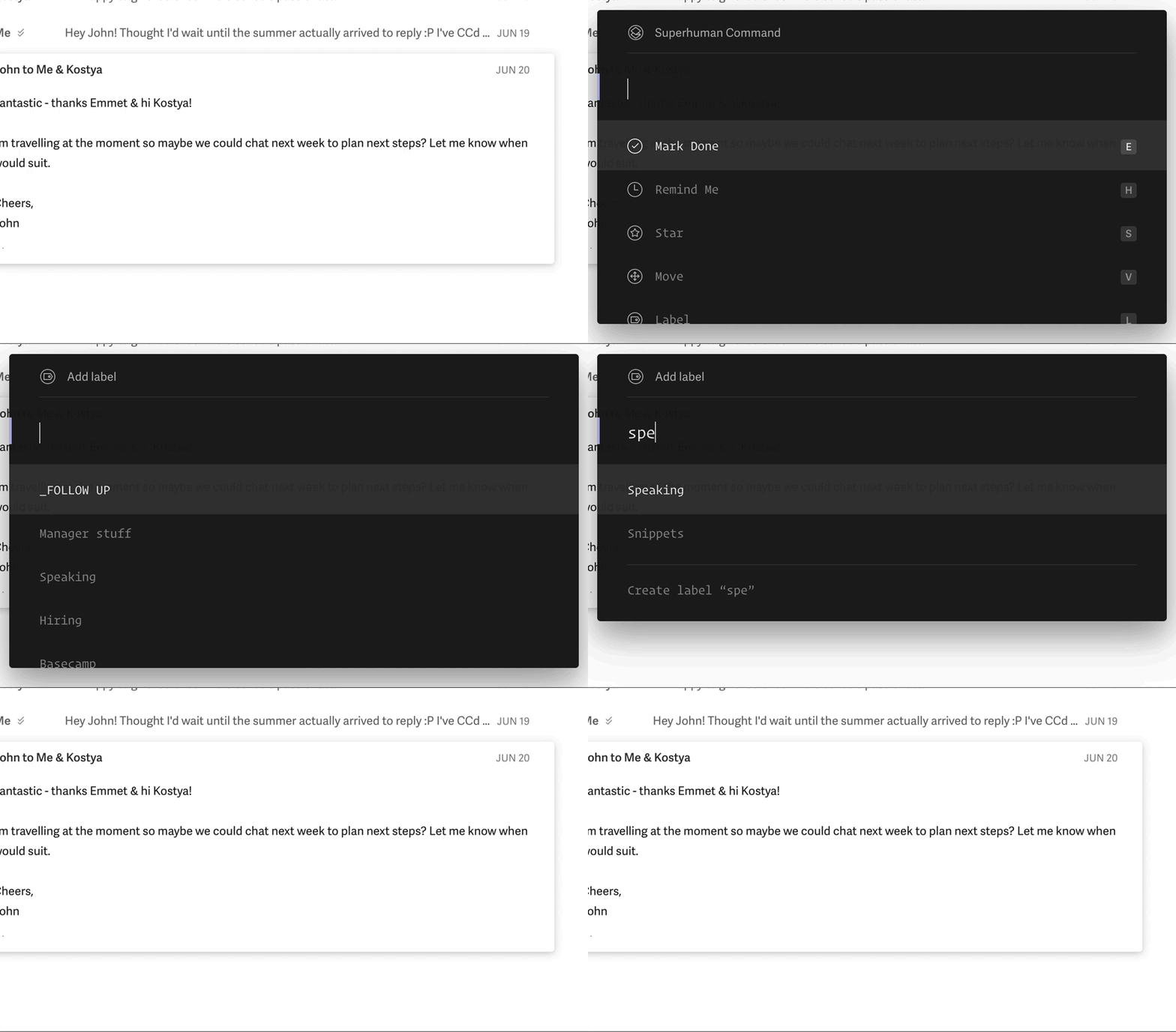
While we don't have a true command palette, we're working on a search bar that will pull up code snippets, help documentation, and relevant toolbar sections. Now users can read anything they are unfamiliar with, plug a search term into the search bar, and find out what it is and how it works. Additionally, if they know which command they want to use but don't know how to write it on their own, they can pull up a toolbar form from this search bar, providing a speed increase over the multi-click oriented user flow they had before.
Something interesting to note about the Superhuman command palette is that it shows all of the keyboard shortcuts you could have used instead for an even faster experience.

Also related - End-user scripting enables creative workaroundsEnd-user scripting enables creative workarounds
User skill level increases over time, and people with high User Involvement understand your app’s core mechanisms so well that, when they face a new problem, they are able to come up with creative workarounds by rubber-banding multiple actions together. It's not uncommon for a new user to request a feature, and then have a more experienced user mention that their request is already possible if they do X, Y, and Z things together, but the best the experienced user can do is recommend that sequ... as another ramp-up in skill level. I'd love to see more command palettes enable end-user scripting, and then community forums to share those scripts.