Note - GuidedTrack gave me permission to share a plan for onboarding that I wrote for them late October. At this point, we had been working together for a few months and this is an iteration on plans we were already working on. Certain aspects have been updated (which I mark with UPDATE) and certain aspects have been added (not in this post, will likely come in future posts), but we're implementing most of this. This post was originally written for the GuidedTrack team, so it assumes some knowledge. If you are not familiar with GuidedTrack, I recommend starting on its page.
If we are to launch GuidedTrackGuidedTrack
GuidedTrack is a simple low-code application that allows you to make surveys, experiments, web applications, online courses, signup forms, and more. Spark Wave built GuidedTrack so that it could build advanced studies and rapidly prototype, and is making the software available more broadly.
Alternative study platforms like Qualtrics and Typeform required so much clicking and dragging that they were tedious and took forever to build. Additionally, it was difficult to package the study itself ... near the beginning of next year, we should have a clear outline of what our current plan is.
TL;DR
-
Change website to increase self-efficacy and obvious goal-relatedness. Show social proof and have mini programs with side-by-side preview for users to see examples that feel doable.
-
Give an initial onboarding questionnaire in GuidedTrack, display to new users with side-by-side preview to show them that it’s not hard to produce a program and they are able to understand the code.
-
Enhance sample programs with side-by-side preview/debugger, make sample programs editable so users don’t need to duplicate them to play around.
-
Let users create a program from a template rather than from scratch. This allows them to create things beyond their present skill level and start with a project.
-
Present real-time in-editor error codes to prevent the user from compiling and seeing a daunting amount of error codes.
-
Direct new users to a Slack group where they can ask quick questions, see how others use GT, and submit feature requests/bug reports. Involve the GT team to ensure questions are answered in a timely manner so there is a moderate-high velocity of interaction.
-
Create a series of starter videos on YouTube. This is where most people search for answers to their questions anyway.
General priorities
Self-efficacySelf-efficacy
Self-efficacy is the belief that you are capable of doing some action, otherwise phrased in here as The user believes that they are capable of performing actions within the app and The user believes that their actions in the app lead to goal achievement.
Self-efficacy is associated with (Bandura, 1998):
setting higher standards in relation to goals
greater effort, persistence, and concentration
adopting a flexible approach to overcoming problems
treating errors as learning experienc...
Self-efficacy is the belief that you are capable of doing some action. You can view my page on self-efficacy for more details.
What's important for our context is that, with high self-efficacy, people care more, adopt more of a growth mindset, and have a higher tolerance for friction. As such, building self-efficacy is a valid method to Intentionally design for failure statesIntentionally design for failure states
A failure state is when users fail to reach their goal in some way. In goal striving, it is inevitable that the user will experience failure states, because a goal is by definition a discrepancy between your desired state of reality and your present state. If we didn't have failure states, the Intention-Behavior Gap There tends to be a gap between what people intend to do and what they actually do, Sheeran & Webb 2016::rmn would be a non-issue (rather than one of the hardest problems in t....
GuidedTrack is easy to learn but initially intimidating to non-technical people. People who don't view themselves as coders see code will assume the Difficulty MatchingDifficulty Matching
The emotional experience of Flow
A flow state is often characterized as optimal human experience. It’s an experience where you are fully focused and energized in what you’re doing, often experiencing a high level of creativity and losing track of time.
The general emotional experience that is being described here is that when a task is too challenging for a user’s current level of ability, they’ll get frustrated and give up. Alternatively, when the task is far too easy, they are likely t... is out of wack and think it's for people who can program (read- not themselves). They won't even try. We know from our user feedback that GuidedTrack is in fact fast and easy to learn for people who try and respond to failure well. Increasing their self-efficacy is how we'll influence them to give it a shot.
When users see code and they can’t predict what the outcome will be, they can be intimidated.
Seeing error messages (literally nonexistent for most apps they use) is intimidating, but they are inevitable obstacles in the user's early learning experience. A text interface for program creation allows people a lot of freedom to be creative and to mess up!
Users need to scale the barriers of fixing errors in order to realize how easy GuidedTrack is to learn. A point where many users experience self-efficacy is when they realize that they can read code and predict what will happen when it’s previewed. They also experience self-efficacy when they realize they can make a program easily with the GuidedTrack ToolbarGuidedTrack Toolbar
One of the biggest fears that new users have related to a programming language is that they have to spend time learning the language before they can build what they want. The no-code movement has capitalized on this, building visual, drag-and-drop interfaces that guide you through the process of creating something that works.
Caleb Figgers expressed it clearly in this tweet:
No-code makes discovery of capabilities easier. A blank text editor or command line is great if you already know what.... They feel even more competent when they realize that they can simply write what they were using the toolbar for before and predict what will happen when it’s previewed.
Tighten feedback loops to build appropriate mental models
In this context, a feedback loop is referring to the process through which people learn through trial-and-error. It's generally well represented in the flowchart below.
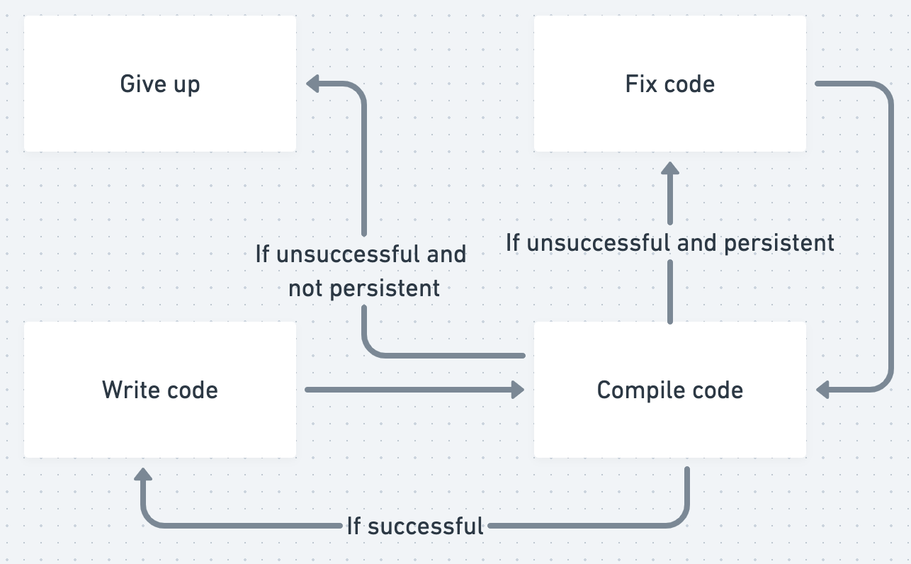
The more time users spend writing code before checking their code in compilation, the more errors will potentially build up. The more errors are built up, the larger the failure state and the worse the user feels. Real-time in-editor error codes has the potential to reduce this problem by showing the user errors as they happen so they can be fixed one at a time, giving users immediate feedback.
UPDATE:
- We will be going with Lyudmil's suggestion here pre-launch or soon post-launch: "Another option is to still compile and detect compilation errors when the user saves, but display those errors in the editor, instead of displaying them when the user tries to preview the program. I suspect that's a big win that we can have without needing to rethink compilation."
- Since the user saves every time they preview, upon returning to the code, they will see the error code as Xs by the side of each line, where they can hover to see the error code. This solves the problem of the user having to remember. If the user has a habit of frequently saving, they will functionally see inline error codes before testing their code in preview.
The GuidedTrack Live PreviewGuidedTrack Live Preview
Originally, GuidedTrack had two separate views for working with your program. You could either be in the code view, where you were editing code, or in the preview, where you saw the output of your code.
There were a few problems with that. One was that people would need to read and write code while picturing in their head what the output would be. Then when they were looking at the preview, they needed to remember the code that would produce what they were seeing. This meant that it was chal.../debugger will make it so the user can see highlighted exactly the code that is producing what they see in the preview. They will know where errors that don’t produce error codes are. The user edits code and then is able to refresh the preview to quickly see the result alongside the code that produced it.
The current version that Lyudmil and I have discussed (which I would be happy with for version 1 that gets released with onboarding), you edit code on the left and the click refresh on the preview on the right to start it over with the updated code.
Ideally, it would be the case that you can edit a line of code, refresh the preview, and see what’s shown on the screen you just edited. Lyudmil has mentioned that there are conceptual and technical challenges, Spencer says there might be some 80/20 solutions that get us most of the way there. If they can figure this out, then this minimizes the time between editing code and seeing what happens as much as possible, giving users the immediate feedback needed to make accurate predictions of what their code will produce.
UPDATE: We're working on an auto-updating version. It's difficult, but from user interviews it seems like it will very clearly be worthwhile to have the preview automatically change in response to changing code. The side-by-side preview has been like a night and day shift in how learnable and approachable GuidedTrack is. Pretty much everyone expected it to auto-update, and it will make the programs significantly more interactive, tightening the feedback loop even further.
Start the user with a goal because a blank page can be daunting
The challenge here is with users who are excited about learning GuidedTrack and want to play around with it but don’t have an idea for what programs to build immediately (see: The user may have a lack of imagination as to what user goals they can accomplishThe user may have a lack of imagination as to what user goals they can accomplish
The user believes that the app will help them achieve a goal that they actually have, but New users do not yet have the vocabulary to understand the app. This means they'll often be painfully unaware of all of the goals that they are able to accomplish.
The app must communicate clearly to the user how the app relates to goals that the user already has. This is part of why I recommend products Use a badging system as a method of actionable user research, even if a badging system isn't ultimat...). We don’t want that scenario to make GT a nonstarter for that user! The most successful app adoptions come from a projectThe most successful app adoptions come from a project
#stub
New users do not yet have the vocabulary to understand the app. A big mistake that many people make when they try out a new app is that they’ll try to understand features in a very abstract sense. They will try to understand what it is without knowing what it is for. When people make this mistake, Adoption goes down. Projects allow the app to Speak to the user with a shared vocabulary. They put functionalities into context, closing the feedback loop on learning the usefulness of said f..., in this case because it will engage the user in feedback loops that we know will help them learn how to use it.
User Flow for Onboarding
Here’s what I see as doable and impactful before launch
Website
When the user is on the website, they should be able to understand what GuidedTrack is and how it fits into the context of their life and goals. They should feel the self-efficacy necessary to know that it’s worth giving a shot.
People should be able to see use cases so they can latch onto examples. This will help them realize how it fits into their life and goals. Ideally, these use cases would come along with simple and short GT programs that they can see with the side-by-side preview/debugger. This shows the user exactly what GT is and demystifies it from coding languages. For many users, the “aha moment” is when they realize they are capable of reading code and predicting the result. If the programs embedded on the website have side-by-side preview and are simple, I predict this would enhance self-efficacy.
People should see successful similar others to increase their self-efficacy. This means that they can see testimonials from researchers, entrepreneurs, and educators.
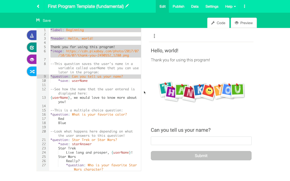
Initial onboarding questionnaire with GuidedTrack Live PreviewGuidedTrack Live Preview
Originally, GuidedTrack had two separate views for working with your program. You could either be in the code view, where you were editing code, or in the preview, where you saw the output of your code.
There were a few problems with that. One was that people would need to read and write code while picturing in their head what the output would be. Then when they were looking at the preview, they needed to remember the code that would produce what they were seeing. This meant that it was chal...
Horizontal productHorizontal product
Definition: Horizontal products can be used by all sorts of people for many different purposes. A vertical product, by comparison, is meant for a specific set of use cases. Most horizontal products are just fancy data structures.
For more details, see Joel Spolsky, the founder of Trello discussing horizontal products.
Another concept that I want to point to here is just the idea of horizontal products having a low floor, wide walls, and a high ceiling. The basic idea is that it should be ea...s like Notion and Trello begin with a series of questions that allow the company to get to know the users a little bit better. We can make this series of questions using GuidedTrack!
In order to bring the user to the “aha moment” that they are capable of reading and producing GT code more quickly, we’ll give them an onboarding questionnaire with the new side-by-side preview/debugger running. The fact that it highlights the active code will make it easier to understand and show off GT’s functionality, increasing self-efficacy and excitement.
The open question I have at this point is which of the following options would be better:
- Show the side-by-side preview as the new user is initially filling out the questionnaire.
- New user fill out the questionnaire like normal. Upon completion, they are launched into the code/preview of the onboarding program they just filled out.
- New user fill out the questionnaire like normal. Upon completion, they are launched into the code/preview of a program that explains how GuidedTrack programs work both through text/multimedia and through the visualization of what code generates the preview that you see. It's meta.
We could run a test with both versions on this. I’m curious to see which group would continue to log on the most after completion, or if either group has a higher likelihood of the user creating their own program.
Update: We're going with option number 3. Just showing the onboarding questionnaire on its own will get people used to what the output of a program is before we ask them to look at the code. We'll still make the program's code visible for people who want to look at it though.
User Exploration
In the prior onboarding questionnaire, we were holding the user’s hand. The user exploration phase refers to when the user is trying to learn on their own. This is when they’ll make their own programs, read through sample programs, ask questions to the community, and explore instructional content.
Users tend to be most successful when they start with some project in mind. On the flip side, they may drop off and give up if they start a program with a blank page and don’t know what to do with it.
From the user interviews, it seemed that playing around with the GuidedTrack ToolbarGuidedTrack Toolbar
One of the biggest fears that new users have related to a programming language is that they have to spend time learning the language before they can build what they want. The no-code movement has capitalized on this, building visual, drag-and-drop interfaces that guide you through the process of creating something that works.
Caleb Figgers expressed it clearly in this tweet:
No-code makes discovery of capabilities easier. A blank text editor or command line is great if you already know what... and looking at the code in sample programs was an effective way to learn. We don’t need to hold the user’s hand for this, though I would make the sample programs directly editable so the user can play around in a sandbox and I would simply add a couple more sample programs. I also believe that the live preview/debugger will significantly improve the learning that comes from exploring existing programs.
Create program from template
I was thinking one of the best ways we could help the user start with a project is to have an option to create program from template. Whenever people make a new program, they can either start it from scratch or from a template. Starting from scratch would be the default state. If the user selects to start from a template, then it would open up a drop down menu. The code from the template they select will be pasted into the new program. We can rework the worksheets we made previously into templates, and this would be a replacement for the way that we currently give new users sample programs.
![]()
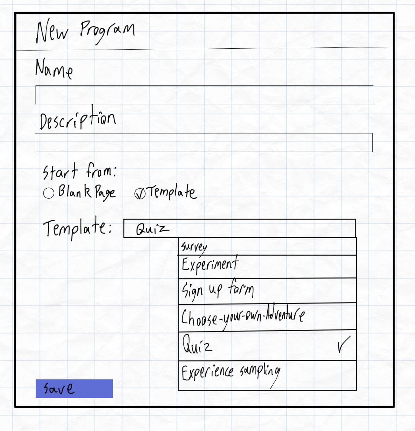
Update: We're thinking that it would actually look better like this. Turns out this isn't too hard to code, so the overly simple UX in the images above aren't necessary.
Some examples of template could include:
- An experiment template, which has an intro/consent page, a few questions of different types, an experiment with two groups, and then a thank you page.
- A contact-form template, which asks for the person’s name, email address, and reason for contacting. At the end, it sends a confirmation email to the participant based on the name and email.
- A feedback form template, which has an intro page and questions of multiple types. In a multiple choice question, we let the participant respond “other” as an option, which is followed up with “why?” as a free response question to show the branching.
- An app onboarding, which could replicate the onboarding questionnaire we’re giving users. This would show off some personalization.
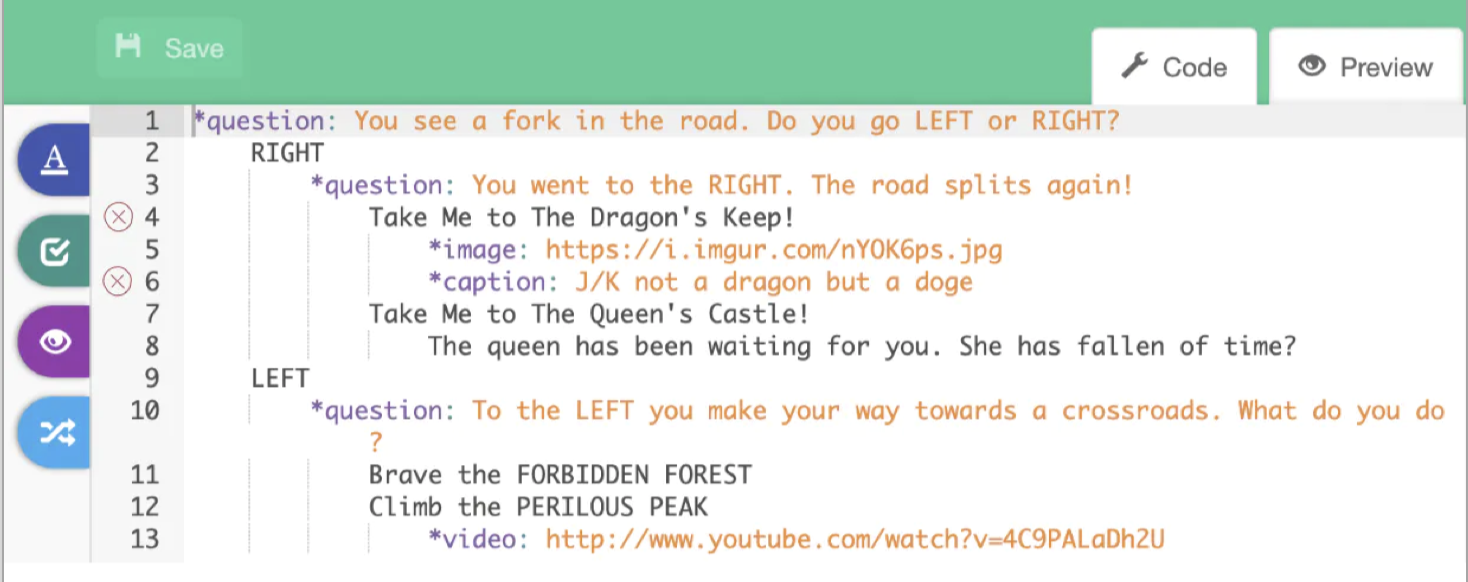
- An interactive lesson. This shows multimedia embeds and branching paths. A page with a video and a multiple choice question. Based on the response, it takes the participant to other pages with a picture, or with containers.
To start out, it would be best to include a premade set of templates. Long-term we could allow the user to have a folder of templates that they can add to, enabling crowdsourcing templates and enhanced workflows.
The user exploration phase will also be enabled by an online community, which I elaborate more on in the next section.
Slack community
An online community is basically table stakes at this point for complex products, and it’s for good reason. Sometimes you just need a human to answer a question, and especially in the early days of a professional product with exciting potential, it is invigorating to explore the product’s capabilities together. In order to gain momentum, we need mass and velocity, but I would emphasize that velocity is likely more important than mass. People need to know that they can start a discussion or ask a question and reliably get a response. We can plant some people from the GT team within the community to ensure this velocity. Common questions should be compiled by the team into a publicly available resource online, likely our Q&A website where everything is google searchable.
In order to gain mass, I propose inviting all users into a Slack group as part of the onboarding, whether it is at the end of the initial questionnaire or as an email. Slack has an advantage over our current Facebook group insofar as we’ll be able to make sub channels and it tends to encourage a higher velocity of interactions.
Some proposed channels:
- General
- Q&A
- Feature Requests
- Bugs
- Workflows
- Introductions
- Research Design
- Show & Tell
In addition to answering quick questions, the Slack community has the benefits of facilitating professional connections and providing inspiration.
Video content
Frankly, there's a lot we can do with just video. We can have a short introductory course, cover advanced subjects, have walk through videos with users to show off real use cases, and make 1-5 minute workflow explainer videos as we go. In comparison to a blog post, YouTube is great at showing implicit processes that an experienced user might not think to write down.
For many people using a complex product, their first instinct is to search YouTube. I recommend we start with a few videos that explain the basics. This includes the flow of a program, indentation, what determines a page's beginning and end, those sorts of things. We can also upload clips of past recorded workshops and demos.
As we progress, I think it would be a good idea to just get into the habit of making 1-4 minute video explainers of little things you do. Loom is a really low friction way to record screen video.
Update: This video discusses the flow of GuidedTrack programs. I explain a lot in a short period of time and it would probably be best to break down each of the core concepts into a two minute video of its own.