One of the biggest fears that new users have related to a programming language is that they have to spend time learning the language before they can build what they want. The no-code movement has capitalized on this, building visual, drag-and-drop interfaces that guide you through the process of creating something that works.
Caleb Figgers expressed it clearly in this tweet:
No-code makes discovery of capabilities easier. A blank text editor or command line is great if you already know what it can do/why it is useful. For those who don’t, an intuitively laid-out UI can double as documentation to quickly communicate what the tool is capable of.
People know what they want to do, but they don't want to spend time reading through documentation in order to figure out how to do it.
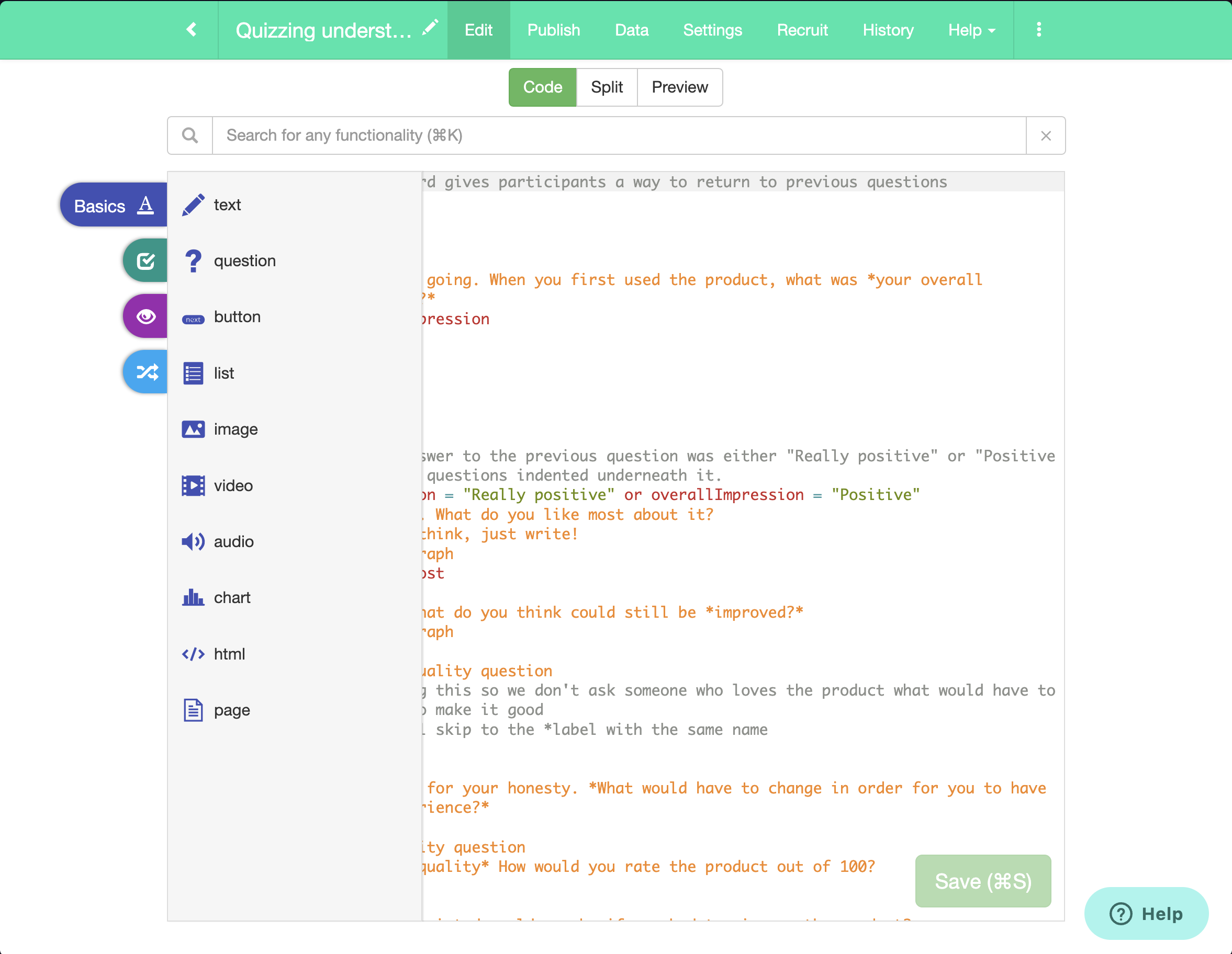
We have two solutions to this. The first is the toolbar. The other is the universal search bar, which I'll describe more in another post in the future. Suffice to say that a user will be able to press a keyboard shortcut to pull up the relevant section of the toolbar. It's not quite a command palette, but it's close.
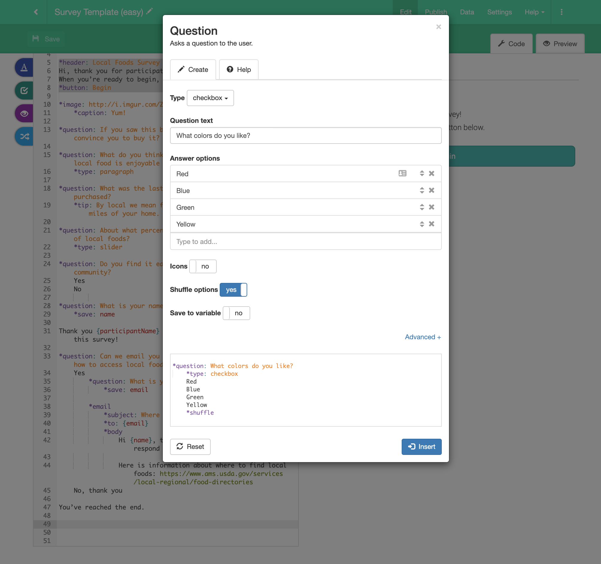
The toolbar creates a form for just about any code that is possible within GuidedTrack. Filling out the form will then generate the appropriate code, and insert it where your cursor was, giving the user the same sorts of guardrails that no-code gives them.
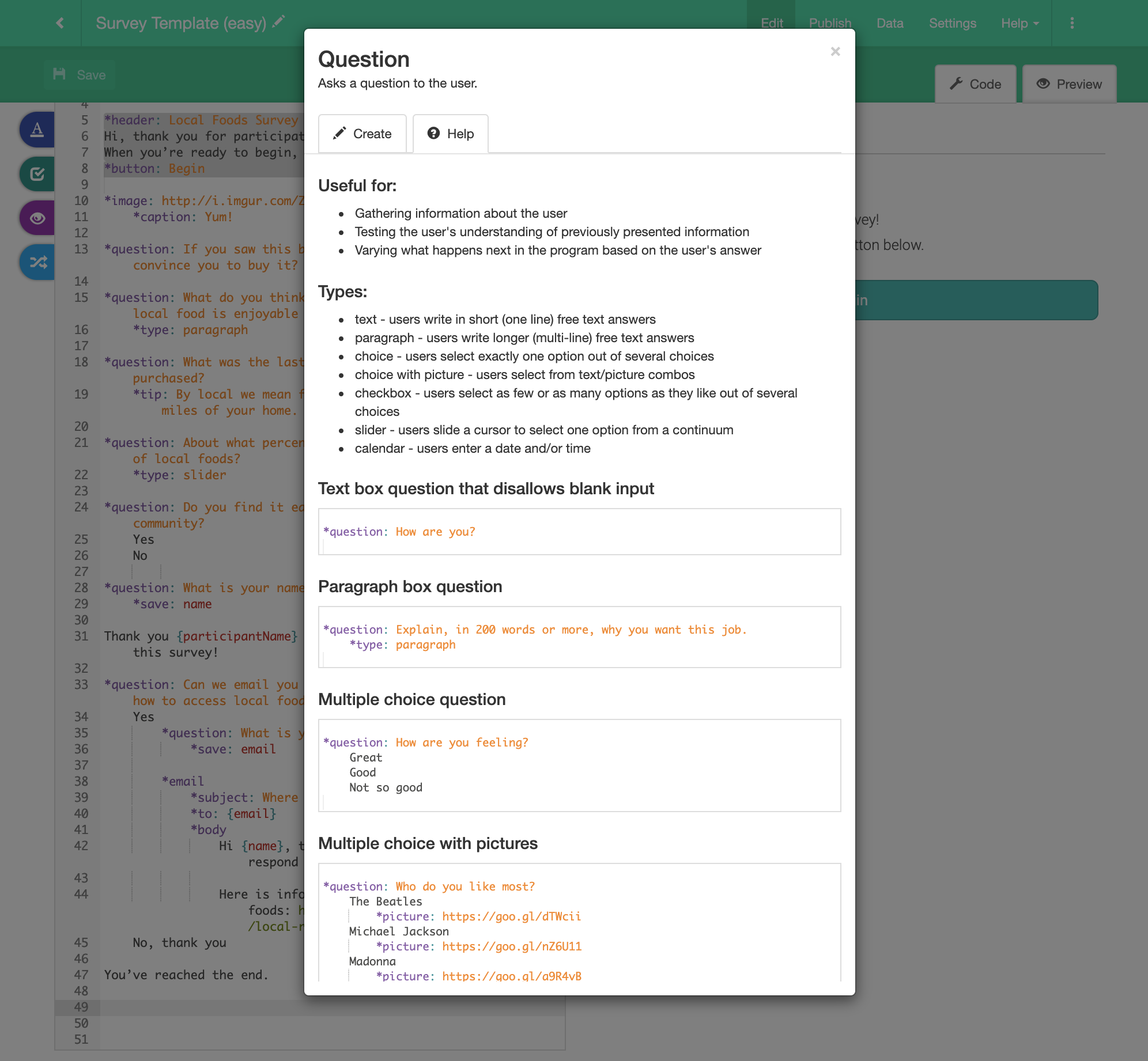
The toolbar section for each command also is connected to help documentation and examples, providing further guidance.
Some notable areas where this doesn't help:
- The toolbar itself won't help you compose items together. There's some room for adjustment here, but only so much.
- This doesn't directly teach users the syntax. For example, they won't necessarily know how indentation works with attributes and branching logic. We expect them to pick that up from the templates and from the GuidedTrack Live PreviewGuidedTrack Live Preview
Originally, GuidedTrack had two separate views for working with your program. You could either be in the code view, where you were editing code, or in the preview, where you saw the output of your code.
There were a few problems with that. One was that people would need to read and write code while picturing in their head what the output would be. Then when they were looking at the preview, they needed to remember the code that would produce what they were seeing. This meant that it was chal.... As we go forward, I'm also really interested to see how user-generated content (primarily programs made by others in the community) would help, but we don't yet have the infrastructure for this.
This example shows the toolbar form for questions, but people can also generate buttons, images, variables, if-then statements, etc. with same toolbar.


