I've noticed a really interesting trend lately in apps built for power usage… When the user starts out, they have a GUI (Graphical User Interface) that helps them learn how to do things. As User skill level increases over timeUser skill level increases over time
Imagine that you have just started to use Excel or Photoshop. Both of those apps have an insane amount of functionality, and it would be unreasonable to expect the user to understand what is possible and how to do it immediately. Over time, with continued User Involvement, they will simply grow more comfortable with the app.
The most successful app adoptions come from a project, because they give the user a reason to increase their skills. As they work on their projects, they'll bump up agai..., they can actually disable elements of the GUI, decreasing the clutter on the screen that they no longer need as a memory aid for how to do X or Y.
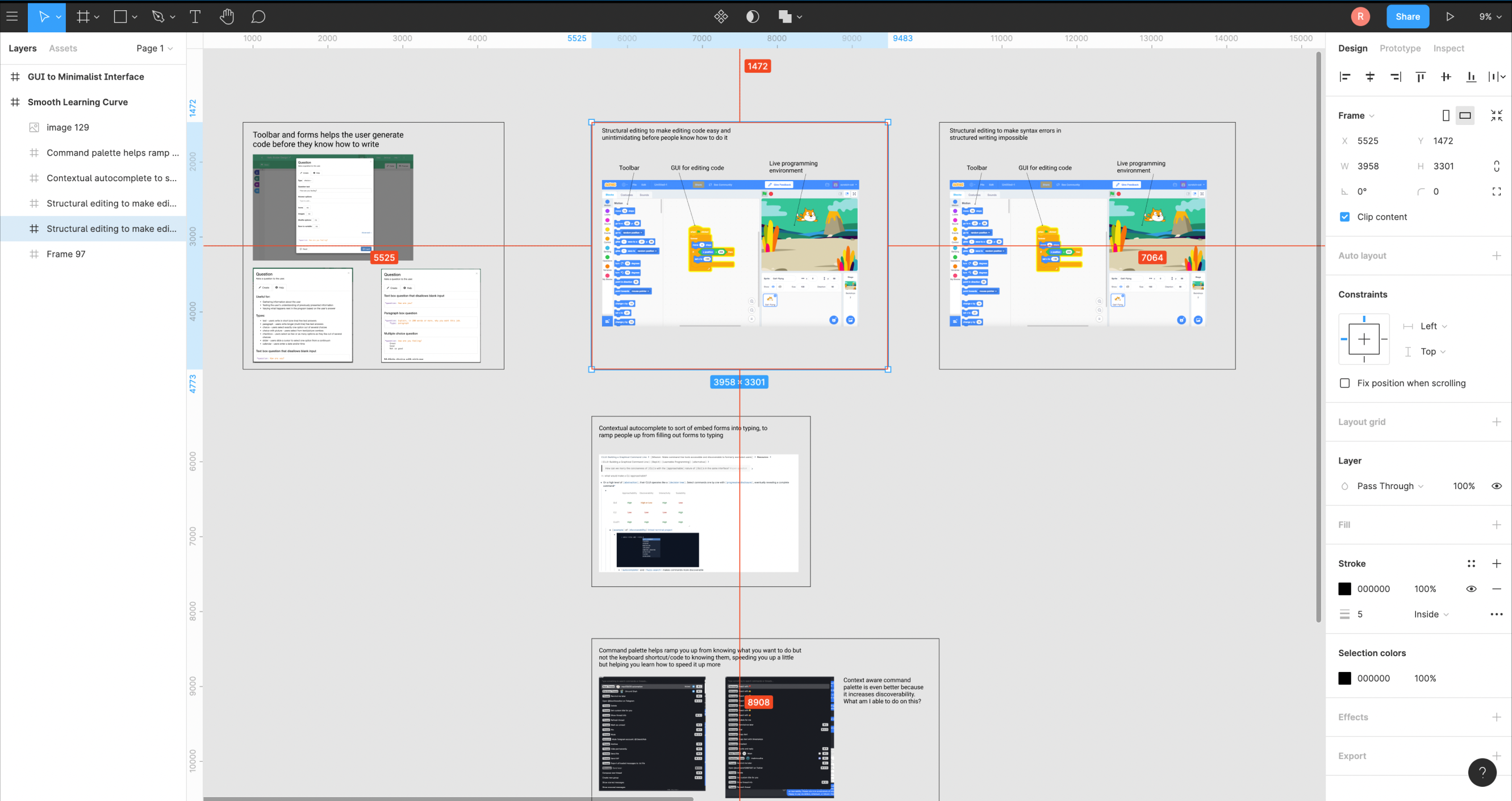
Take a look at how Figma shows you all of these buttons you can click that would modify your selection. This helps the new user discover what is possible!

Eventually, Figma users will learn keyboard shortcuts. At this point, they can press a shortcut (command+period on Mac) that will disable most of the UI. Now they are just interacting directly with Figma's infinite canvas data structure. Advanced users speed up and enter a flow state with total immersion. Manipulating a file feels as intuitive as reaching to grab something. It's just like movement.

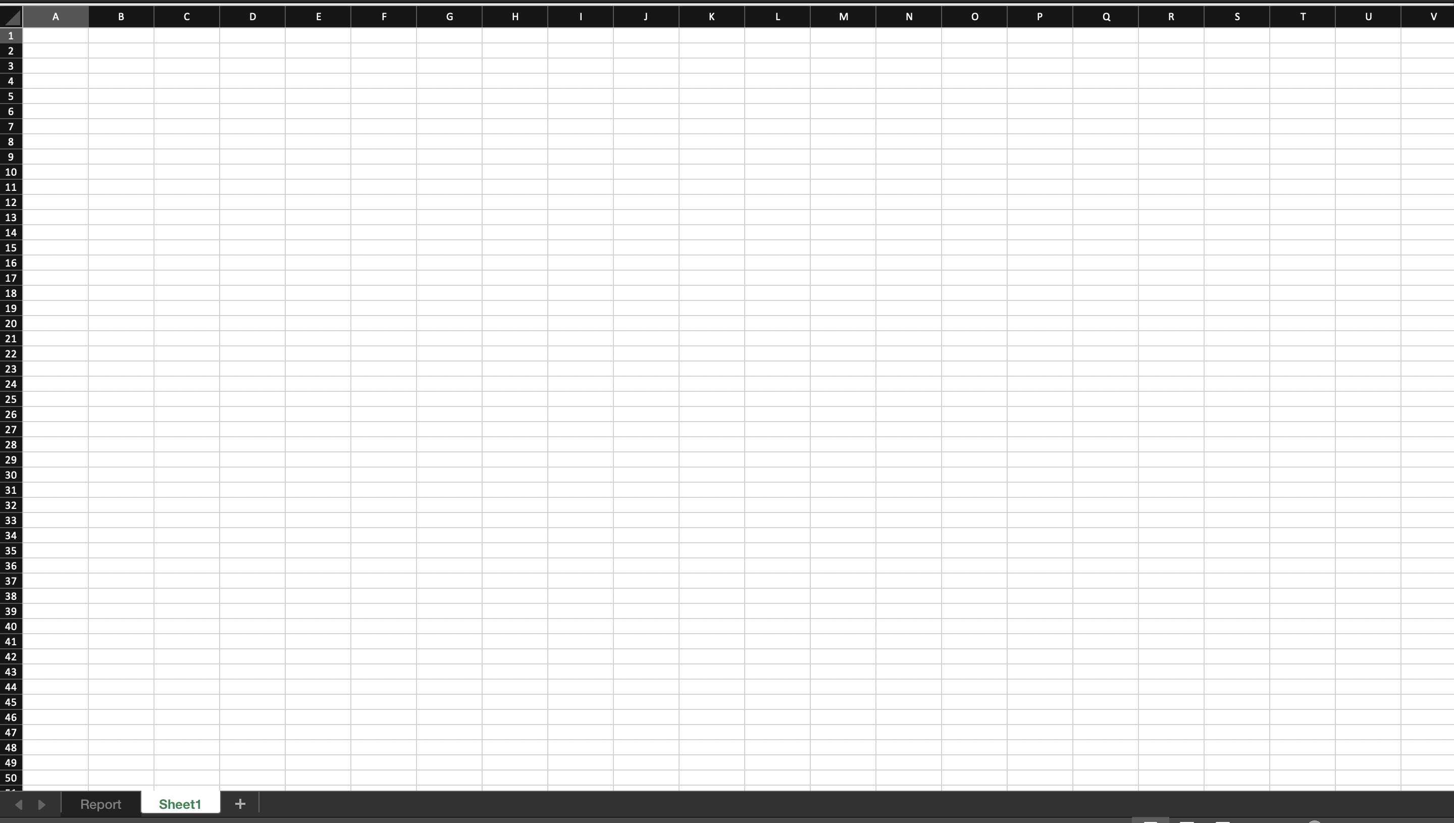
I recently saw a post on LinkedIn where someone shared a five page PDF filled with keyboard shortcuts in Excel. Can you imagine how rewarding your mastery would feel if you learned all of them, and were able to interact with just a spreadsheet? No BS that clogs your screen, just rows and columns? You know how the data structure works and how to move… wouldn't those training wheels just feel like clutter?

In GuidedTrackGuidedTrack
GuidedTrack is a simple low-code application that allows you to make surveys, experiments, web applications, online courses, signup forms, and more. Spark Wave built GuidedTrack so that it could build advanced studies and rapidly prototype, and is making the software available more broadly.
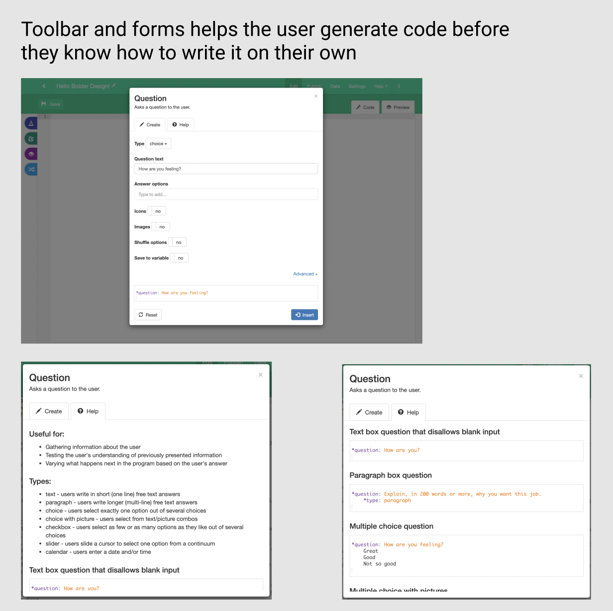
Alternative study platforms like Qualtrics and Typeform required so much clicking and dragging that they were tedious and took forever to build. Additionally, it was difficult to package the study itself ..., you start out using the GuidedTrack ToolbarGuidedTrack Toolbar
One of the biggest fears that new users have related to a programming language is that they have to spend time learning the language before they can build what they want. The no-code movement has capitalized on this, building visual, drag-and-drop interfaces that guide you through the process of creating something that works.
Caleb Figgers expressed it clearly in this tweet:
No-code makes discovery of capabilities easier. A blank text editor or command line is great if you already know what... and filling out forms that generate code for you based on your inputs. Eventually, you're just writing the code yourself.

When you're at the point where you're just writing code instead of using the toolbar, you aren't slowed down by having to click through a bunch of different screens. The user actually gets faster, as they're able to produce code as quickly as they can type. We're using the GUI as training wheels for more efficient workflows, whereas GUI first applications like Tripetto won't get much quicker after you learn how to use it.
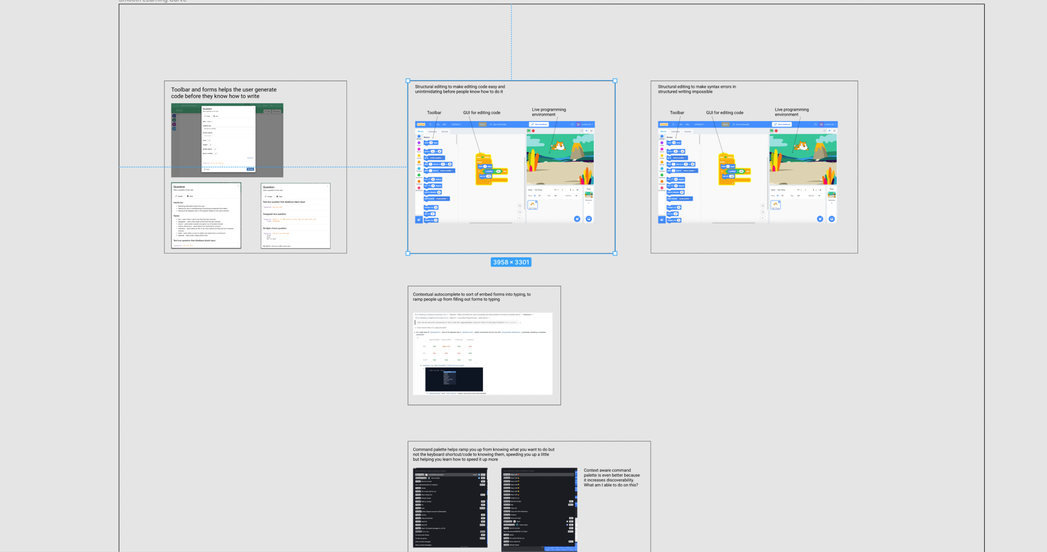
This is a Figma file, so you can move around it with normal zoom-pan controls (pinch or scroll your mouse to zoom, click-drag to pan)
I'll need to think about this more, but in general the trend seems to go as following: the GUI provides training wheels to understand the data structure of the application, and power users eventually want to interact with the application's data structure as directly as possible, with as much information density as possible. The next question becomes: How might we Provide a smooth learning curve from new user to power userProvide a smooth learning curve from new user to power user
Apps built for power usage are capable of so many things that they can't be learned in a day. This points towards the necessity of Continuous onboarding - if we tried to shove all of that information down the user's throat too early, they would just get intimidated and quit.
Given that I'm working on the onboarding for GuidedTrack, I'll talk about how we're creating a smooth learning curve. If a goal is Removing GUI elements as the user's skill level increases to allow the user to interact m...?
As Joel Spolsky says, Horizontal productHorizontal product
Definition: Horizontal products can be used by all sorts of people for many different purposes. A vertical product, by comparison, is meant for a specific set of use cases. Most horizontal products are just fancy data structures.
For more details, see Joel Spolsky, the founder of Trello discussing horizontal products.
Another concept that I want to point to here is just the idea of horizontal products having a low floor, wide walls, and a high ceiling. The basic idea is that it should be ea...s are just fancy data structures. How might we give users as much power over that structure as possible?
What was I talking about? Oh yeah… most people just used Excel to make lists. Suddenly we understood why Lotus Improv, which was this fancy futuristic spreadsheet that was going to make Excel obsolete, had failed completely: because it was great at calculations, but terrible at creating tables, and everyone was using Excel for tables, not calculations.
Bing! A light went off in my head.
The great horizontal killer applications are actually just fancy data structures.
Spreadsheets are not just tools for doing “what-if” analysis. They provide a specific data structure: a table. Most Excel users never enter a formula. They use Excel when they need a table. The gridlines are the most important feature of Excel, not recalc.
Word processors are not just tools for writing books, reports, and letters. They provide a specific data structure: lines of text which automatically wrap and split into pages.
PowerPoint is not just a tool for making boring meetings. It provides a specific data structure: an array of full-screen images.